Introduction
Imagine walking into a physical store for the first time. Before speaking to anyone, you naturally look around. You notice whether the store is clean, organised, professional, and easy to understand. You quickly try to figure out what the store sells and whether it has what you are looking for. If everything feels confusing, crowded, or unprofessional, you may simply walk out. A website works in a very similar way.
When someone visits a website for the first time, they immediately begin forming an opinion about the business. They may look at the headline, images, navigation, colours, buttons, and overall layout before they read a single paragraph. Within a short amount of time, they decide whether the website looks relevant, trustworthy, and worth exploring. This is why the first few seconds of a website visit matter so much.
A business may have excellent products, highly experienced employees, competitive pricing, and outstanding customer service. But if its website does not communicate these strengths effectively, visitors may never discover them. The purpose of a good website is therefore not simply to look attractive. It should communicate the right message, create trust, answer the visitor's most important questions, and guide them toward the next step.
The First Few Seconds Matter
People rarely visit a website with the intention of carefully reading every word on the homepage. Most visitors scan the page first. They look at the main heading, images, buttons, navigation, and other visual elements to understand what the website is about. This is especially important for businesses because visitors often arrive with a specific question or requirement.
For example, someone searching for a web development company may immediately want to know whether the company builds websites. Someone looking for a restaurant may want to know what kind of food it serves. Someone looking for an online course may want to know what they can learn, while someone searching for a product may want to know what the product is and why they should consider buying it. A website that answers these questions quickly creates clarity, while a website that makes visitors search for the answers creates friction.
The first section of a website should therefore focus on helping visitors understand the most important information as quickly as possible. The goal is not to tell them everything immediately, but to give them enough information to understand that they are in the right place.
The Hero Section: Your Website's First Handshake
The first large section that appears when a visitor opens a homepage is commonly called the hero section. It is one of the most important areas of a website because it often creates the visitor's initial impression. Think of the hero section as the digital equivalent of a first handshake.
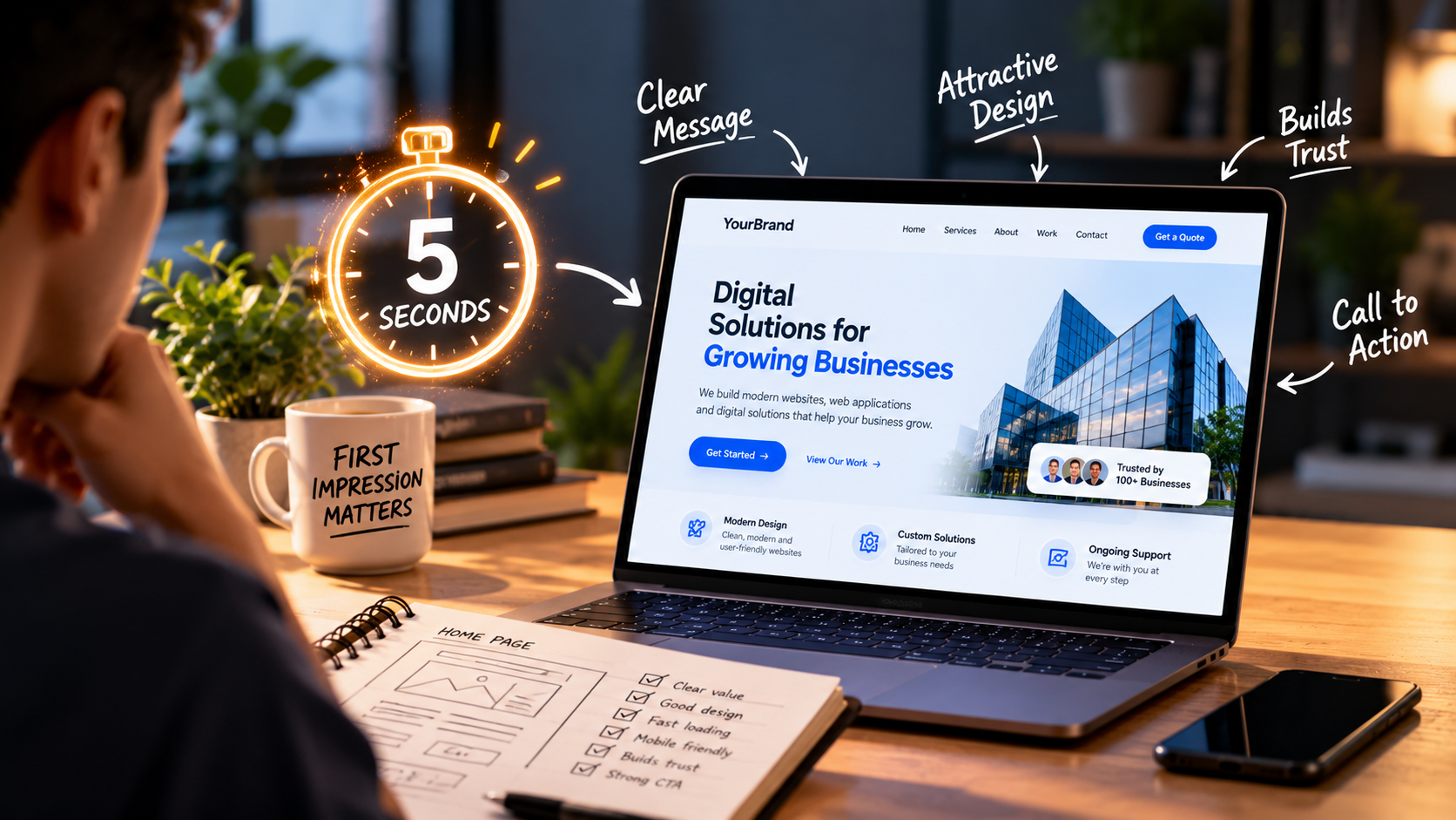
A strong hero section normally contains a clear headline, a supporting description, a relevant visual, and a call-to-action. The headline should explain the primary value of the business. The supporting text can provide additional context. The visual should reinforce the message rather than simply decorate the page. Finally, the call-to-action should tell visitors what they can do next.
For example, imagine two websites. The first website says, “Welcome to Our Website.” The second says, “Custom Digital Solutions That Help Businesses Grow.” The second headline immediately provides more information. A visitor can understand the general purpose of the business without scrolling through the page. This is what a good hero section should accomplish. It should not make visitors work to understand the website.
Your Headline Should Answer One Simple Question
One of the first things visitors notice is the main headline. It should communicate the most important message in a simple and understandable way. A common mistake is using headlines that sound impressive but do not actually explain anything. Words such as “Innovation,” “Excellence,” “The Future Starts Here,” or “Transforming Possibilities” may sound professional, but they do not necessarily tell visitors what the company actually does.
A stronger approach is to connect the headline with the customer's problem or desired outcome. Instead of saying, “We Create Digital Experiences,” a business could say, “We Build Fast, Modern Websites for Growing Businesses.” The second version is more specific and allows visitors to immediately understand what the company offers.
A good headline does not have to be complicated. In fact, simple language is often more effective because visitors can understand it without spending time interpreting it. The headline should communicate value rather than simply trying to sound impressive.
Show Visitors What You Actually Do
A website should never force visitors to investigate several pages just to understand what a business offers. If a company provides web development services, the homepage should make that clear. If it sells products, visitors should immediately understand what type of products are available. If it provides consulting, the website should communicate the type of problems it helps customers solve.
The goal is not to explain everything immediately. The goal is to provide enough information for the visitor to say, “Okay, this is what I was looking for.” Once that happens, the visitor is more likely to continue exploring the website.
Clear communication is particularly important for businesses offering technical services. Terms such as artificial intelligence, cloud computing, automation, APIs, blockchain, or machine learning may be meaningful to technical users, but not every potential customer understands them. A website should therefore explain technical solutions in terms of the value they provide to the customer.
Instead of simply saying, “We provide AI-powered automation solutions,” a business could explain, “Automate repetitive tasks and save your team time with intelligent AI-powered solutions.” The second message connects the technology to a practical benefit and makes it easier for a wider audience to understand.
Design Should Support the Message
A visually attractive website can create a positive first impression, but attractive design alone does not make a website successful. A website can contain beautiful animations, gradients, videos, illustrations, and interactive elements while still being difficult to use.
The purpose of design is to make information easier to understand. Typography should make content readable. Colours should create visual hierarchy. Spacing should prevent the page from feeling crowded. Images should support the content, and buttons should be easy to identify.
Every visual element should have a reason for being there. For example, if a large animation takes up most of the screen but does not help visitors understand the business, it may be distracting rather than useful.
Good design is not about adding as many elements as possible. It is about deciding which elements deserve the visitor's attention. A clean website can often feel more professional than a complicated one because visitors can easily understand where to look and what to do.
Use Visuals With a Purpose
Images are powerful because people can process visual information quickly. However, not every image improves a website. A business website should use images that support its message.
A software company could show its product dashboard. A construction company could show completed projects. A restaurant could showcase its food and dining environment. A design agency could display its previous work. These images provide context and help visitors understand what the business actually does.
On the other hand, using unrelated stock images simply because they look attractive may not add much value. The question should not simply be, “Does this image look nice?” The better question is, “Does this image help the visitor understand or trust the business?”
When visuals and content communicate the same message, the website becomes easier to understand and more memorable.
Trust Is Just as Important as Design
Getting a visitor's attention is only the first step. The next challenge is convincing them that the business is worth trusting. People are naturally cautious when dealing with an unfamiliar company online. Before submitting their information, making a payment, or contacting a business, they often look for signals of credibility.
A website can build trust through customer testimonials, case studies, client logos, certifications, awards, team information, and examples of previous work. These elements give visitors evidence that the business has experience and can deliver what it promises.
Professional presentation also contributes to trust. Clear contact information, consistent branding, easy navigation, quality content, and a well-maintained website can make a business appear more credible.
However, businesses should avoid filling their websites with exaggerated claims simply to look impressive. Genuine information and real examples are much more valuable because they help visitors make an informed decision. Visitors are more likely to trust what they can see than a long list of unsupported claims.
Make the Next Step Obvious
Once a visitor understands what the business does and feels comfortable with the website, they need to know what to do next. This is where a call-to-action, or CTA, becomes important.
A CTA is usually a button or link that encourages the visitor to take a specific action. Examples could include “Get a Quote,” “Book a Consultation,” “Start Your Project,” “View Our Services,” “Explore Our Work,” “Contact Us,” or “Request a Demo.”
The right CTA depends on the purpose of the website and what action the business wants visitors to take. A visitor who is still learning about a company may prefer to explore its services, while someone who is ready to work with the company may want to request a quote.
The CTA should be noticeable without being distracting. If every button on the page is competing for attention, visitors may become confused. A website should guide people toward the most useful next step instead of giving them too many decisions at once.
Don't Give Visitors Too Many Choices
Having a clear CTA is important, but having too many CTAs can have the opposite effect. Imagine opening a homepage and seeing ten different buttons competing for your attention. One says “Learn More,” another says “Get Started,” another says “Our Services,” another says “Contact,” and several others appear throughout the first section.
Instead of helping the visitor, the website may create confusion. This is why websites should establish a clear visual hierarchy. There can be multiple actions available, but one primary action should generally stand out.
For example, a business could make “Get a Quote” its primary CTA while providing secondary links to its portfolio and services. The visitor should feel guided rather than pressured.
Website Speed Is Part of the First Impression
A website's first impression is not only visual. Performance matters too. Imagine finding a website that looks exactly like what you were searching for. You click the link, but the page takes several seconds to load. You wait again for the images to appear. The menu does not respond immediately. You click a button, and nothing seems to happen.
Even if the website eventually loads correctly, the first impression has already been affected. Slow websites can create frustration and encourage visitors to leave before seeing the content.
Large uncompressed images are one common reason websites become slower. Videos, animations, third-party scripts, unnecessary plugins, and inefficient code can also affect performance. Businesses should therefore treat website performance as part of the user experience.
Images should be optimised, unnecessary resources should be removed, and websites should be tested on different devices and network conditions. A fast website communicates something important without saying a word: it shows that the business values the visitor's time.
Mobile Experience Cannot Be an Afterthought
A website may look excellent on a large desktop screen but provide a completely different experience on a smartphone. Since many users browse websites from mobile devices, businesses need to make mobile responsiveness a priority.
Text should remain readable, buttons should be easy to tap, images should fit the screen, and navigation should remain simple. Important information should not be hidden behind complicated menus or placed so far down the page that visitors struggle to find it.
Mobile-friendly design is not simply about shrinking a desktop website. It requires thinking about how information should be organised when the available screen space is much smaller. The order of information may need to change, buttons may need to become larger, navigation may need to become simpler, and certain decorative elements may need to be removed.
The mobile experience should be designed around how people actually use their phones. If visitors have to zoom in, scroll horizontally, or struggle to tap a button, the website is creating unnecessary friction.
Don't Make Visitors Search for Important Information
One of the most frustrating website experiences is having to search for basic information. Visitors should be able to find important details without spending several minutes navigating the website.
For a business, this could include information about its services, location, contact details, areas of specialisation, previous work, or how visitors can request more information. The exact information will depend on the business, but the principle remains the same: important information should be easy to find.
Navigation should therefore be simple and predictable. A visitor should not need to understand the company's internal structure to navigate its website. The website should be organised around the visitor's needs rather than the organisation's internal terminology.
The Homepage Doesn't Need to Tell the Whole Story
Some businesses try to put everything on the homepage. They include their entire company history, every service, every testimonial, several banners, long descriptions, team biographies, FAQs, blog posts, and promotional offers.
The result can be overwhelming.
A homepage should act as an introduction rather than an entire company database. Its job is to help visitors understand the business and guide them toward the information they need. Detailed information can be placed on separate pages such as About, Services, Portfolio, Case Studies, Blog, and Contact.
This creates a logical structure and allows visitors to choose where they want to go. A good website does not force everyone to consume the same information. Instead, it allows visitors to choose their own journey based on what they need.
Good UX Means Less Thinking
All of these elements are connected to one larger concept: User Experience, or UX. UX is essentially about how easy and pleasant it is for someone to use a product or service.
On a website, good UX means visitors can understand information, navigate between pages, find what they need, and complete actions without unnecessary confusion.
Consider something as simple as a contact form. If a form asks for twenty different pieces of information when only a name, email address, and message are necessary, visitors may decide not to complete it. Reducing the form to the information that is actually needed can create a much better experience.
The same principle applies to navigation, checkout processes, search functions, buttons, and content. Good UX often means removing unnecessary steps and making the user's journey as simple as possible.
When designing a website, businesses should think from the visitor's perspective rather than only thinking about what they want to display. A simple question can help: “If I am visiting this website for the first time, what would I want to know?”
Content Should Be Easy to Scan
Even when visitors are interested in a topic, they may not read every word on a webpage. Many people scan content first before deciding which sections deserve their attention.
This is why headings, subheadings, short paragraphs, images, whitespace, and clear content structure are important. A large wall of text can make useful information feel difficult to access.
Breaking content into logical sections allows visitors to quickly identify the parts that are relevant to them. This is particularly important for business websites because visitors often arrive with limited time.
Good content structure respects that time. The goal is not to make every section extremely short. The goal is to make information easy to understand and navigate.
Accessibility Should Be Part of Good Design
A website should be usable by as many people as possible. Accessibility involves designing websites in ways that can accommodate users with different abilities and needs.
Readable text, sufficient contrast, descriptive links, keyboard-friendly navigation, alternative text for meaningful images, and properly structured content can all contribute to a more accessible website.
Accessibility is not simply a technical requirement. It is also part of creating a better digital experience. When websites are easier to understand and navigate, more people can use them comfortably.
Businesses that consider accessibility from the beginning can create websites that provide a better experience for a wider range of visitors.
Small Details Can Change the Entire Experience
A website's overall quality is often influenced by small details. A button that changes appearance when a user hovers over it can make the interface feel responsive. Consistent spacing can make a page feel organised. Clear error messages can help users recover from mistakes. A confirmation message after submitting a form can reassure visitors that their request was received.
These details may seem small individually, but together they contribute to how polished a website feels.
On the other hand, small mistakes can have the opposite effect. Broken links, spelling errors, missing images, inconsistent fonts, outdated information, and forms that do not work can quickly reduce confidence.
Professional websites are therefore built with attention to both the large picture and the small details. Every interaction contributes to the overall experience.
Test the Website Like a First-Time Visitor
Developers and designers often become too familiar with the websites they build. Because they already know where everything is located, they may not notice problems that a new visitor experiences.
One useful approach is to ask someone who has never seen the website to open it and explore it without giving them instructions. After they have looked around, ask them what they think the company does, what they noticed first, where they would click if they wanted to contact the company, and whether anything felt confusing.
The answers can reveal problems that the development team may have overlooked. Sometimes the simplest usability test can provide valuable insights because a fresh visitor does not have the assumptions that the people who built the website already have.
The Five-Second Test
There is a simple exercise businesses can use to evaluate their homepage. Open the website and look at it for only a few seconds. Then close it or look away and ask yourself what you remember.
Could you identify the company? Could you explain what it offers? Could you identify its target audience? Could you remember the main call-to-action?
If the answer is no, the website may need clearer messaging.
This does not mean that every visitor will literally spend only five seconds on the website. The five-second idea is simply a useful way to think about how quickly a website should communicate its basic value.
The website should make a strong enough first impression that visitors can understand its purpose almost immediately.
What Businesses Should Avoid
There are several common mistakes that can weaken a website's first impression. One mistake is using too much text above the fold. Visitors should not have to read a long paragraph before understanding what the business does.
Another mistake is using vague headlines. Creative language can be useful, but clarity should come first. Poor navigation is another issue because visitors should not have to search through several menus to find basic information.
Excessive pop-ups can also interrupt the experience. While pop-ups can have useful purposes, showing them too early can prevent visitors from exploring the website naturally. Autoplay videos and sounds can also be distracting, particularly when visitors are browsing from public places.
Finally, businesses should avoid designing websites only for themselves. The website should be built around the needs, questions, and expectations of the people who will actually use it.
A Strong First Impression Is a Complete Experience
A strong website first impression is not created by one particular element. It is the result of several things working together. The headline communicates the message, the design creates visual clarity, the imagery provides context, trust signals create confidence, the navigation provides direction, the performance creates convenience, and the call-to-action gives visitors a clear next step.
When all of these elements work together, the website feels natural to use. Visitors do not have to stop and think about where to click or what the company does. The information flows naturally from one section to another.
This is one of the most important goals of good web design: making the experience feel simple even when a lot of thought and technical work has gone into creating it.
First Impressions Should Lead to Long-Term Relationships
The purpose of a strong first impression is not simply to make a website look impressive. It is to start a relationship with the visitor.
A visitor may first discover a business through Google, social media, an advertisement, a recommendation, or a shared link. The website then becomes one of the first places where that visitor interacts directly with the business.
If the experience is clear and professional, the visitor may explore the services, read the blog, check the portfolio, contact the company, or eventually become a customer. The website is therefore not just a digital brochure. It can become a major part of the customer's journey.
A good first impression opens the door. Good content, good service, and a good overall experience are what encourage the visitor to stay.
Conclusion
A website has only a short opportunity to communicate its value to a new visitor. That does not mean a business needs to fill its homepage with every possible feature, animation, image, and piece of information. In fact, doing so can make the experience worse.
What matters is clarity.
Visitors should quickly understand what the business does, why it may be relevant to them, why they should trust it, and what they can do next. A strong first impression comes from several elements working together: a clear headline, purposeful design, relevant visuals, trust signals, fast performance, mobile responsiveness, simple navigation, readable content, and a well-defined call-to-action.
The most successful websites do not try to impress visitors with everything they can do. They focus on giving visitors the information they need at the right moment.
Ultimately, your website does not need to say everything in the first five seconds.
It simply needs to say the right things.